Webflow Responsive MOGRTs
I created a set of fully responsive motion graphics templates (mogrts) for Webflow's team to use in their video content. I worked in After Effects and JavaScript to build lower thirds and end cards that can be customized directly inside of Premiere Pro by other editors at Webflow.
After Effects

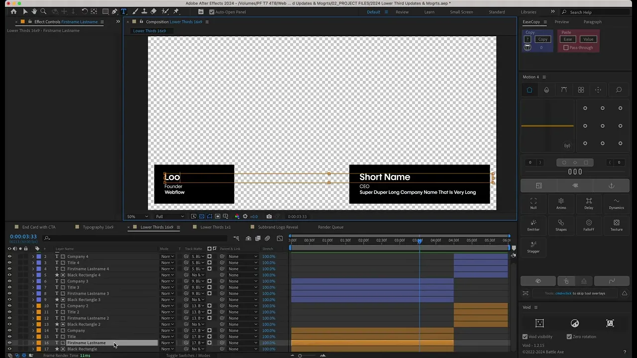
This first mogrt was a set of customizable lower thirds. I built them to resized based on the length of the name, title, or company, and they also had a double lower third option in case two people were being introduced together.
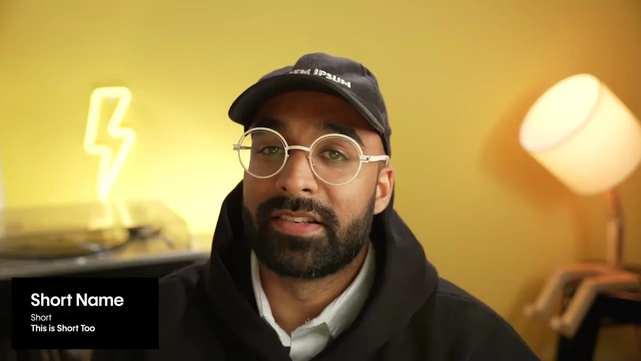
I used After Effects expressions (JavaScript) to create lower thirds that scale based on text length while staying locked in the correct position. The lower third on the right is also connected to a checkbox, so it can be turned on or off depending on whether or not there are two people onscreen.
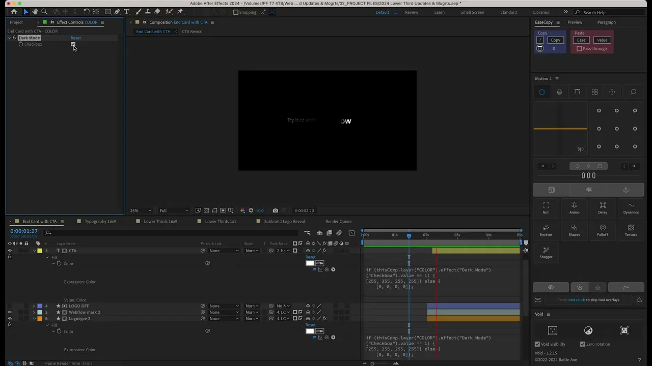
I built this end card that can be used for Webflow’s various subbrands, events, and affinity groups. I used JavaScript to make the animation start and end centered, regardless of the length of the text. In Premiere, editors simply need to type the subbrand text they want into a text field, and all the animation happens behind the scenes.

Here you can see that I connected some layers (the CTA text and the logotype, in this example) to a checkbox that toggles between dark mode and light mode.